Data table
Data tables organize and display data in the Siteimprove UI. Column headers can sort data in ascending or descending order, cells and rows can be expanded to progressively disclose related information, and single or batch actions can be taken on rows.
The table toolbar gives a location for primary buttons, search, filtering, table display settings, and other utilities. For the component itself, see Table. To decide whether a table is the right choice at all, see Table vs. list.
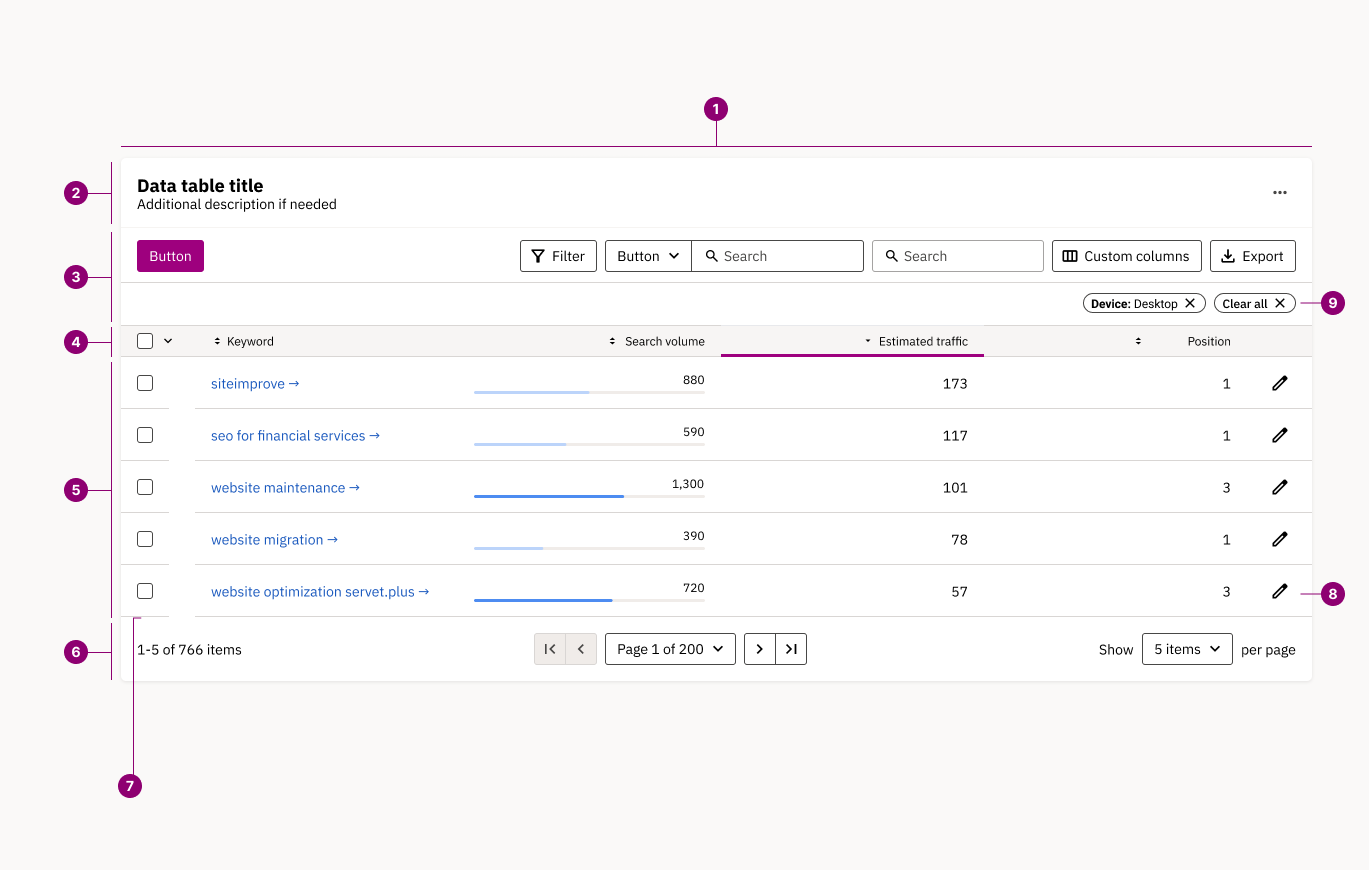
Anatomy
- Card (container): tables are always contained within a card.
- Card header: contains title, optional description and optional button (e.g. for add to dashboard action).
- Table toolbar: global table actions and controls including search, filter, views and export.
- Header row: defines what each column represents and typically provides sorting controls.
- Table rows: different cell variants show different types of data. Rows can be selectable, expandable, and contain local row actions.
- Pagination controls: an optional component that allows the user to view data as pages when the amount of data is too large to be shown at once.
- Row checkbox: enables bulk selection of table rows for performing batch actions like delete, edit, or export across multiple data items.
- Row action: a row-level action lets users perform specific tasks on that row’s data, like edit or delete, directly from the table.
- Filter pills: show which filters are currently active on the table and allow users to remove them with one click.
Columns and rows
Rows
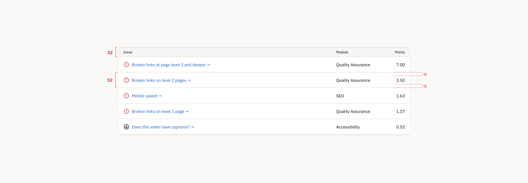
The baseline row height is 52px and the column header row height is 32px. Row height may expand to fit content. Column header row height is fixed to 32px. Vertical row padding is at least 12px.
Columns
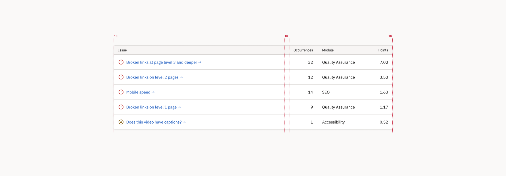
Column headers have 16px horizontal padding and maintain at least 32px spacing between columns. All cell data is aligned left, with the exception of numerical data (aligned right).
Truncation
Column headers shouldn’t truncate — if space is limited, show full text in a tooltip on hover. Body text can wrap up to 2 lines before truncating, with full content shown on hover. Wrap and truncation behavior can be defined in the component properties.
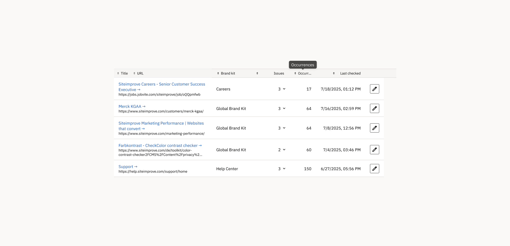
Sorting
Columns sort ascending or descending, with the active sort state clearly indicated by a directional caret in the header (downward caret = descending sort).
Contact | 0 | 11,456 |
|---|---|---|
About us | 3 | 21,487 |
Home | 12 | 32,156 |
Careers | 27 | 16,890 |
<Table
	caption="Sorting"
	columns={[pageColumn, issuesColumn, visitsColumn]}
	{...useSortedRows("issues")}
/>Row hover
Table rows should display a subtle background color change on hover to improve data scanning and readability. This hover state helps users visually track across columns in dense tables and maintain their place when comparing data, even when rows aren’t interactive.
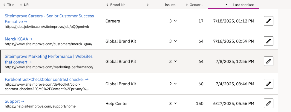
Highlighted row
Highlights provide additional visual prominence to a row — new rows added to a table, for example, or a row the user has just acted on.
The same highlight carries the selected state. Rows checked for a bulk action are highlighted for as long as the selection stands, so the rows the bulk action bar is about to act on are obvious at a glance. See Batch actions below.
About us | 3 | 21,487 |
|---|---|---|
Careers | 27 | 16,890 |
Contact | 0 | 11,456 |
Home | 12 | 32,156 |
<Table
	caption="Highlighted row"
	columns={[pageColumn, issuesColumn, visitsColumn]}
	highlightRow={(dto) => dto.page === "Careers"}
	{...useSortedRows()}
/>Checked rows
Row checkboxes enable multi-selection with individual checkboxes per row, while the header checkbox selects all rows and shows three states: checked, unchecked, and indeterminate (when some rows are selected).
About us | 3 | 21,487 | |
|---|---|---|---|
Careers | 27 | 16,890 | |
Contact | 0 | 11,456 | |
Home | 12 | 32,156 |
const table = useSortedRows();
const [selected, setSelected] = useState<number[]>([2]);
const allSelected = selected.length === table.items.length;
const someSelected = selected.length > 0 && !allSelected;
return (
	<Table
		caption="Checked rows"
		columns={[
			{
				header: {
					contentNode: (
						<Checkbox
							name="check-all"
							value="all"
							checked={allSelected}
							indeterminate={someSelected}
							onChange={() => setSelected(allSelected ? [] : table.items.map((i) => i.id))}
						>
							<SrOnly>Select all pages</SrOnly>
						</Checkbox>
					),
				},
				options: { width: 48 },
				render: (dto) => (
					<Checkbox
						name={`check-${dto.id}`}
						value={`${dto.id}`}
						checked={selected.includes(dto.id)}
						onChange={() =>
							setSelected(
								selected.includes(dto.id)
									? selected.filter((n) => n !== dto.id)
									: [...selected, dto.id]
							)
						}
					>
						<SrOnly>Select {dto.page}</SrOnly>
					</Checkbox>
				),
			},
			pageColumn,
			issuesColumn,
			visitsColumn,
		]}
		highlightRow={(dto) => selected.includes(dto.id)}
		{...table}
	/>
);Starred rows
Starred rows remain pinned at the top of the table regardless of sorting or filtering, allowing users to keep important items easily accessible.
Starred | |||
|---|---|---|---|
Careers | 27 | 16,890 | |
About us | 3 | 21,487 | |
Contact | 0 | 11,456 | |
Home | 12 | 32,156 |
const table = useSortedRows();
const [starred, setStarred] = useState<number[]>([3]);
const items = useMemo(
	() => [
		...table.items.filter((i) => starred.includes(i.id)),
		...table.items.filter((i) => !starred.includes(i.id)),
	],
	[table.items, starred]
);
return (
	<Table
		caption="Starred rows"
		columns={[
			{
				header: { contentNode: <SrOnly>Starred</SrOnly> },
				options: { width: 48 },
				render: (dto) => (
					<Button
						variant="borderless"
						aria-label={starred.includes(dto.id) ? `Unstar ${dto.page}` : `Star ${dto.page}`}
						onClick={() =>
							setStarred(
								starred.includes(dto.id)
									? starred.filter((n) => n !== dto.id)
									: [...starred, dto.id]
							)
						}
					>
						<Icon
							fill={
								starred.includes(dto.id)
									? "var(--color--border--interactive--selected)"
									: undefined
							}
						>
							{starred.includes(dto.id) ? <IconStar /> : <IconUnstar />}
						</Icon>
					</Button>
				),
			},
			pageColumn,
			issuesColumn,
			visitsColumn,
		]}
		{...table}
		items={items}
	/>
);Thumbnails
When displaying visual content like website pages or images, include a thumbnail in the leftmost column (after checkbox/selection controls if present). Thumbnails should maintain consistent 60x45px dimensions and be vertically centered within the row. Pair thumbnails with the primary identifier (page title, name) for easy recognition and scanning.
Thumbnail | |||
|---|---|---|---|
About us | 3 | 21,487 | |
Careers | 27 | 16,890 | |
Contact | 0 | 11,456 | |
Home | 12 | 32,156 |
<Table
	caption="Thumbnails"
	columns={[
		{
			header: { contentNode: <SrOnly>Thumbnail</SrOnly> },
			options: { width: 76 },
			render: (dto) => (
				<div
					aria-hidden="true"
					style={{
						width: 60,
						height: 45,
						borderRadius: 2,
						background: "var(--color--background--static--secondary, #e6e6e6)",
						border: "1px solid var(--color--border--default, #d4d4d4)",
					}}
					title={dto.page}
				/>
			),
		},
		pageColumn,
		issuesColumn,
		visitsColumn,
	]}
	{...useSortedRows()}
/>Summary row
When column totals are required, use an optional sticky summary row immediately after the header. The row has distinct styling to differentiate it from data rows. There is an option to make the summary row sticky so it remains visible during scrolling, keeping key metrics accessible while users explore detailed data below.
42 total | 81,989 total | |
About us | 3 | 21,487 |
Careers | 27 | 16,890 |
Contact | 0 | 11,456 |
Home | 12 | 32,156 |
const table = useSortedRows();
const locale = useFormattingLanguage();
const totals = useMemo(
	() => ({
		issues: table.items.reduce((sum, i) => sum + i.issues, 0),
		visits: table.items.reduce((sum, i) => sum + i.visits, 0),
	}),
	[table.items]
);
return (
	<Table
		caption="Summary row"
		columns={[
			pageColumn,
			{
				...issuesColumn,
				summary: {
					value: toFormattedNumberString({ number: totals.issues, locale }),
					label: "total",
				},
			},
			{
				...visitsColumn,
				summary: {
					value: toFormattedNumberString({ number: totals.visits, locale }),
					label: "total",
				},
			},
		]}
		{...table}
	/>
);Inline actions
Show row-specific actions as icon-only buttons in the rightmost column, so each action is a single click away. Only move them into an overflow menu (three-dot button) when a row has more than three, where a strip of icons would start to crowd the row.
Up to three actions — icon buttons.
Actions | ||
|---|---|---|
About us | 3 | |
Careers | 27 | |
Contact | 0 | |
Home | 12 |
More than three — collapse into an overflow menu.
Actions | ||
|---|---|---|
About us | 3 | |
Careers | 27 | |
Contact | 0 | |
Home | 12 |
const upToThree = useSortedRows();
const moreThanThree = useSortedRows();
return (
	<Content gap="large" padding="none">
		<div>
			<Paragraph>Up to three actions — icon buttons.</Paragraph>
			<Table
				caption="Inline icon buttons"
				columns={[
					pageColumn,
					issuesColumn,
					{
						header: { contentNode: <SrOnly>Actions</SrOnly> },
						options: { align: "right" },
						render: (dto) => (
							<Content gap="xSmall" padding="none" justifyContent="flex-end">
								<Button variant="borderless" aria-label={`Edit ${dto.page}`}>
									<Icon>
										<IconEdit />
									</Icon>
								</Button>
								<Button variant="borderless" aria-label={`Duplicate ${dto.page}`}>
									<Icon>
										<IconCopy />
									</Icon>
								</Button>
								<Button variant="borderless" aria-label={`Delete ${dto.page}`}>
									<Icon>
										<IconDelete />
									</Icon>
								</Button>
							</Content>
						),
					},
				]}
				{...upToThree}
			/>
		</div>
		<div>
			<Paragraph>More than three — collapse into an overflow menu.</Paragraph>
			<Table
				caption="Overflow menu"
				columns={[
					pageColumn,
					issuesColumn,
					{
						header: { contentNode: <SrOnly>Actions</SrOnly> },
						options: { align: "right" },
						render: (dto) => (
							<ActionMenu
								hideChevron
								aria-label={`Actions for ${dto.page}`}
								buttonContent={
									<Icon>
										<IconOptions />
									</Icon>
								}
								items={[
									{ text: "Run page check", onClick: () => undefined },
									{ text: "Edit page", onClick: () => undefined },
									{ text: "Duplicate page", onClick: () => undefined },
									{ text: "Delete page", onClick: () => undefined },
								]}
							/>
						),
					},
				]}
				{...moreThanThree}
			/>
		</div>
	</Content>
);Column order guideline
Tables should follow a logical left-to-right hierarchy supporting user scanning and task flows. This guideline should be followed closely, but designers need to prioritize column order based on specific user context and workflow needs over rigid patterns.
Key principle: flow from selection → identification → core data → metadata → visualizations → date → actions, prioritizing left-to-right task completion and cognitive load.
- Checkbox: leftmost for selection.
- Starred: immediately after checkbox for priority items.
- Title/URL or link: primary identifier, early for scanning.
- Text/number: core data in order of importance.
- Expandable cell: detailed content access, often numerical.
- Tags: descriptive metadata, mid-table.
- Data visualization: visual data summaries, e.g. progress bar, gauge.
- Date: temporal context before actions.
- Button/actions: rightmost for task completion.
const table = useSortedRows();
const [selected, setSelected] = useState<number[]>([]);
const [starred, setStarred] = useState<number[]>([1]);
const toggle = (list: number[], id: number) =>
	list.includes(id) ? list.filter((n) => n !== id) : [...list, id];
return (
	<Table
		caption="Recommended column order"
		columns={[
			{
				header: { contentNode: <SrOnly>Select</SrOnly> },
				options: { width: 48 },
				render: (dto) => (
					<Checkbox
						name={`order-${dto.id}`}
						value={`${dto.id}`}
						checked={selected.includes(dto.id)}
						onChange={() => setSelected(toggle(selected, dto.id))}
					>
						<SrOnly>Select {dto.page}</SrOnly>
					</Checkbox>
				),
			},
			{
				header: { contentNode: <SrOnly>Starred</SrOnly> },
				options: { width: 48 },
				render: (dto) => (
					<Button
						variant="borderless"
						aria-label={starred.includes(dto.id) ? `Unstar ${dto.page}` : `Star ${dto.page}`}
						onClick={() => setStarred(toggle(starred, dto.id))}
					>
						<Icon
							fill={
								starred.includes(dto.id)
									? "var(--color--border--interactive--selected)"
									: undefined
							}
						>
							{starred.includes(dto.id) ? <IconStar /> : <IconUnstar />}
						</Icon>
					</Button>
				),
			},
			{
				header: { property: "page", content: "Page", defaultSortDirection: "asc" },
				render: (dto) => <Link href="#column-order-guideline">{dto.page}</Link>,
				options: { isKeyColumn: true },
			},
			issuesColumn,
			{
				...visitsColumn,
				expandOptions: {
					canCellExpand: () => true,
					cellExpandRenderer: (dto: Row) => (
						<Paragraph>
							A breakdown of the <FormattedNumber number={dto.visits} /> visits.
						</Paragraph>
					),
				},
			},
			{
				header: { content: "Tags" },
				render: (dto) => (
					<Badge type="neutral">{dto.issues > 10 ? "Needs work" : "Healthy"}</Badge>
				),
			},
			{
				header: { content: "Score" },
				options: { width: 140 },
				render: (dto) => (
					<div style={{ width: 110 }}>
						<ProgressBar
							value={100 - dto.issues * 2}
							total={100}
							colorRange="cool"
							aria-label={`Score for ${dto.page}`}
						/>
					</div>
				),
			},
			{
				header: { property: "updated", content: "Last updated" },
				render: (dto) => dto.updated,
			},
			{
				header: { contentNode: <SrOnly>Actions</SrOnly> },
				options: { align: "right" },
				render: (dto) => (
					<Content gap="xSmall" padding="none" justifyContent="flex-end">
						<Button variant="borderless" aria-label={`Edit ${dto.page}`}>
							<Icon>
								<IconEdit />
							</Icon>
						</Button>
						<Button variant="borderless" aria-label={`Delete ${dto.page}`}>
							<Icon>
								<IconDelete />
							</Icon>
						</Button>
					</Content>
				),
			},
		]}
		{...table}
	/>
);Behavior
Expandable cells
Cells can expand to show a nested table with related details. Nested tables support standard features like filtering and pagination, but avoid adding excessive functionality that could impact usability.
About us | 21,487 | |
|---|---|---|
Careers | 16,890 | |
Contact | 0 | 11,456 |
Home | 32,156 |
<Table
	caption="Expandable cells"
	columns={[
		pageColumn,
		{
			...issuesColumn,
			expandOptions: {
				canCellExpand: (dto: Row) => dto.issues > 0,
				cellExpandRenderer: (dto: Row) => (
					<Paragraph>
						The {dto.issues} issues on {dto.page} would be listed here, in a nested table.
					</Paragraph>
				),
			},
		},
		visitsColumn,
	]}
	{...useSortedRows()}
/>Horizontal scroll
Tables should avoid horizontal scrolling by default, but when additional columns exceed viewport width, preserve column widths and data legibility through horizontal scroll rather than cramping content.
There is an option to make the first column sticky during horizontal scroll to maintain context and row identification.
Use a subtle inner shadow or gradient overlay at the table edge to indicate overflow content. Minimum column widths should be determined by the designer based on content type and user context rather than fixed standards.
Success criteria | Conformance | Responsibility | Element type | Difficulty | ||||
|---|---|---|---|---|---|---|---|---|
About us | 4.1.2: Name, Role, Value | Level AAA | Content writing | Headings | Expert | 3 | 21,487 | 2 Aug 2026 |
Careers | 1.4.8: Visual Presentation | Level AA | Visual design | Page layout | Intermediate | 27 | 16,890 | 29 Jul 2026 |
Contact | 4.1.2: Name, Role, Value | Level AAA | Content writing | Headings | Expert | 0 | 11,456 | 11 Jul 2026 |
Home | 1.4.8: Visual Presentation | Level AA | Visual design | Page layout | Intermediate | 12 | 32,156 | 14 Aug 2026 |
<Table
	caption="Horizontal scroll"
	columns={[
		{
			header: { property: "page", content: "Page", defaultSortDirection: "asc" },
			render: (dto) => nowrap(dto.page),
			options: { isKeyColumn: true },
		},
		{
			header: { content: "Success criteria" },
			render: (dto) =>
				nowrap(dto.issues > 10 ? "1.4.8: Visual Presentation" : "4.1.2: Name, Role, Value"),
		},
		{
			header: { content: "Conformance" },
			render: (dto) => nowrap(dto.issues > 10 ? "Level AA" : "Level AAA"),
		},
		{
			header: { content: "Responsibility" },
			render: (dto) => nowrap(dto.issues > 10 ? "Visual design" : "Content writing"),
		},
		{
			header: { content: "Element type" },
			render: (dto) => nowrap(dto.issues > 10 ? "Page layout" : "Headings"),
		},
		{
			header: { content: "Difficulty" },
			render: (dto) => nowrap(dto.issues > 10 ? "Intermediate" : "Expert"),
		},
		{ ...issuesColumn, render: (dto: Row) => nowrap(dto.issues) },
		{ ...visitsColumn, render: (dto: Row) => nowrap(<FormattedNumber number={dto.visits} />) },
		{
			header: { property: "updated", content: "Last updated" },
			render: (dto) => nowrap(dto.updated),
		},
	]}
	{...useSortedRows()}
/>Batch actions
When multiple rows are selected via checkboxes, display a contextual toolbar with relevant batch actions (delete, export, edit) that operate on all selected items. The batch toolbar should appear prominently and show the number of selected items for clear feedback.
About us | 3 | 21,487 | |
|---|---|---|---|
Careers | 27 | 16,890 | |
Contact | 0 | 11,456 | |
Home | 12 | 32,156 |
const table = useSortedRows();
const bulk = useBulkActions(table.items.length, (i: Row) => i.id, {
	initialSelectedIds: [1, 3],
});
const barProps = bulk.getBarProps(table.items);
const { allSelected, someSelected } = bulk.pageState(table.items);
return (
	<>
		<BulkActionBar
			{...barProps}
			actions={[
				{ text: "Edit tags", icon: <IconEdit />, onClick: () => undefined },
				{ text: "Export", icon: <IconDownload />, onClick: () => undefined },
			]}
			destructiveAction={{ text: "Delete", onClick: () => undefined }}
			onDismiss={() => bulk.clear()}
		/>
		<Table
			caption="Batch actions"
			columns={[
				{
					header: {
						contentNode: (
							<Checkbox
								name="batch-all"
								value="all"
								checked={allSelected}
								indeterminate={someSelected}
								onChange={() => (allSelected ? bulk.clear() : barProps.onSelectPage())}
							>
								<SrOnly>Select all pages</SrOnly>
							</Checkbox>
						),
					},
					options: { width: 48 },
					render: (dto) => (
						<Checkbox
							name={`batch-${dto.id}`}
							value={`${dto.id}`}
							checked={bulk.isSelected(dto) === true}
							onChange={() => bulk.toggleRow(dto)}
						>
							<SrOnly>Select {dto.page}</SrOnly>
						</Checkbox>
					),
				},
				pageColumn,
				issuesColumn,
				visitsColumn,
			]}
			highlightRow={(dto) => bulk.isSelected(dto) === true}
			{...table}
		/>
	</>
);Search
Tables can include a search input that filters results in real time as the user types. Matching text is highlighted within visible rows, and non-matching rows are hidden from the table to show only relevant results.
Title / URL | Brand kit | Issues |
|---|---|---|
Opens in new tab: Merck KGaAsiteimprove.com/customers/merck-kgaa | Global Brand Kit | 3 |
const [query, setQuery] = useState("Merck");
const matches = searchRows.filter((r) =>
	`${r.title} ${r.url}`.toLowerCase().includes(query.toLowerCase())
);
return (
	<>
		<TableToolbar
			search={
				<InputField
					aria-label="Search pages"
					placeholder="Search pages"
					type="search"
					value={query}
					onChange={setQuery}
				/>
			}
		/>
		<Table
			caption="Pages with issues"
			columns={[
				{
					header: { content: "Title / URL" },
					render: (dto) => (
						<TitleUrl
							title={dto.title}
							url={dto.url}
							link={`https://${dto.url}`}
							searchQuery={{ query }}
						/>
					),
					options: { isKeyColumn: true },
				},
				{ header: { content: "Brand kit" }, render: (dto) => dto.brandKit },
				{
					header: { content: "Issues" },
					options: { align: "right" },
					render: (dto) => dto.issues,
				},
			]}
			items={matches}
			sort={null}
			setSort={() => undefined}
			loading={false}
			noDataState={<Paragraph>No pages match “{query}”.</Paragraph>}
		/>
	</>
);AI in tables
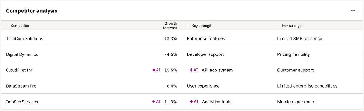
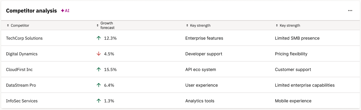
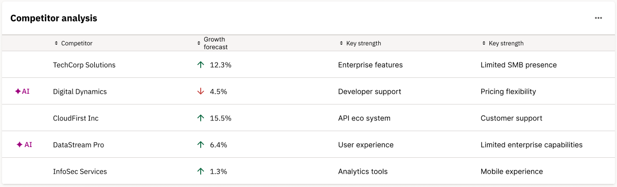
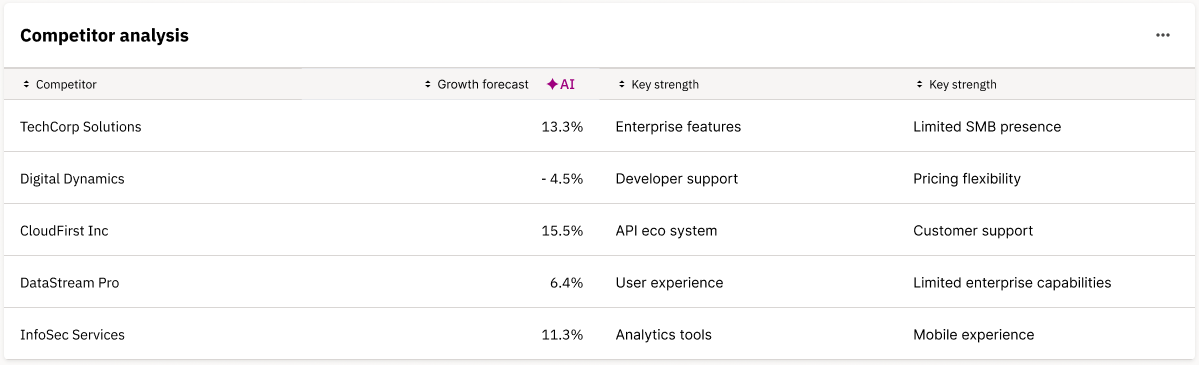
Tables should clearly indicate where AI has contributed to data generation, analysis, or recommendations while maintaining table functionality and readability. Visual indicators scale appropriately based on the scope of AI involvement — from individual cells to entire tables.
Table indicator
Clearly indicate if content belonging to an entire table is generated by AI.
Row indicators
Clearly indicate if content belonging to an entire row of the table is generated by AI.
Column indicators
Clearly indicate if content belonging to an entire column of the table is generated by AI.
Individual cell indicators
Clearly indicate specific cells where AI has generated individual values.